


The OSKO company cares about preserving the health of lovers of sweets, therefore all products are produced without the use of GMOs, food additives and low-grade raw materials. A well-functioning control system at various stages of production allows us to maintain product quality at the highest level, which has been confirmed more than once at national and international exhibitions.
The main areas of production at the moment are: gingerbread, sugar cookies, shortbread, marshmallows, Turkish delight and waffles.
Task
We were commissioned to redesign and update the packaging in general and the logo in particular so that the brand could reach the federal level in the middle price segment.
The design should be understandable to the consumer, evoke associations with traditional family values, home comfort and warmth, convey the naturalness of the product and convey the taste “familiar from childhood.”
Solution
The first difficulty we faced was to find an answer to the question: how to change the packaging in such a way as to evoke in buyers’ associations with traditional family values, home comfort and warmth, convey the naturalness of the products and convey the taste “familiar from childhood”?
At the same time, it was important not only to focus the design on the main target audience of 35+, but also to attract young, ambitious people who were raised in traditional families and love gingerbread.
The answer to the question was found in the very essence of our brand. “Mikhailovskie Skazki” are not just gingerbread cookies, but a delicacy that takes you back to childhood and is an integral part of a cozy tea party with loved ones.
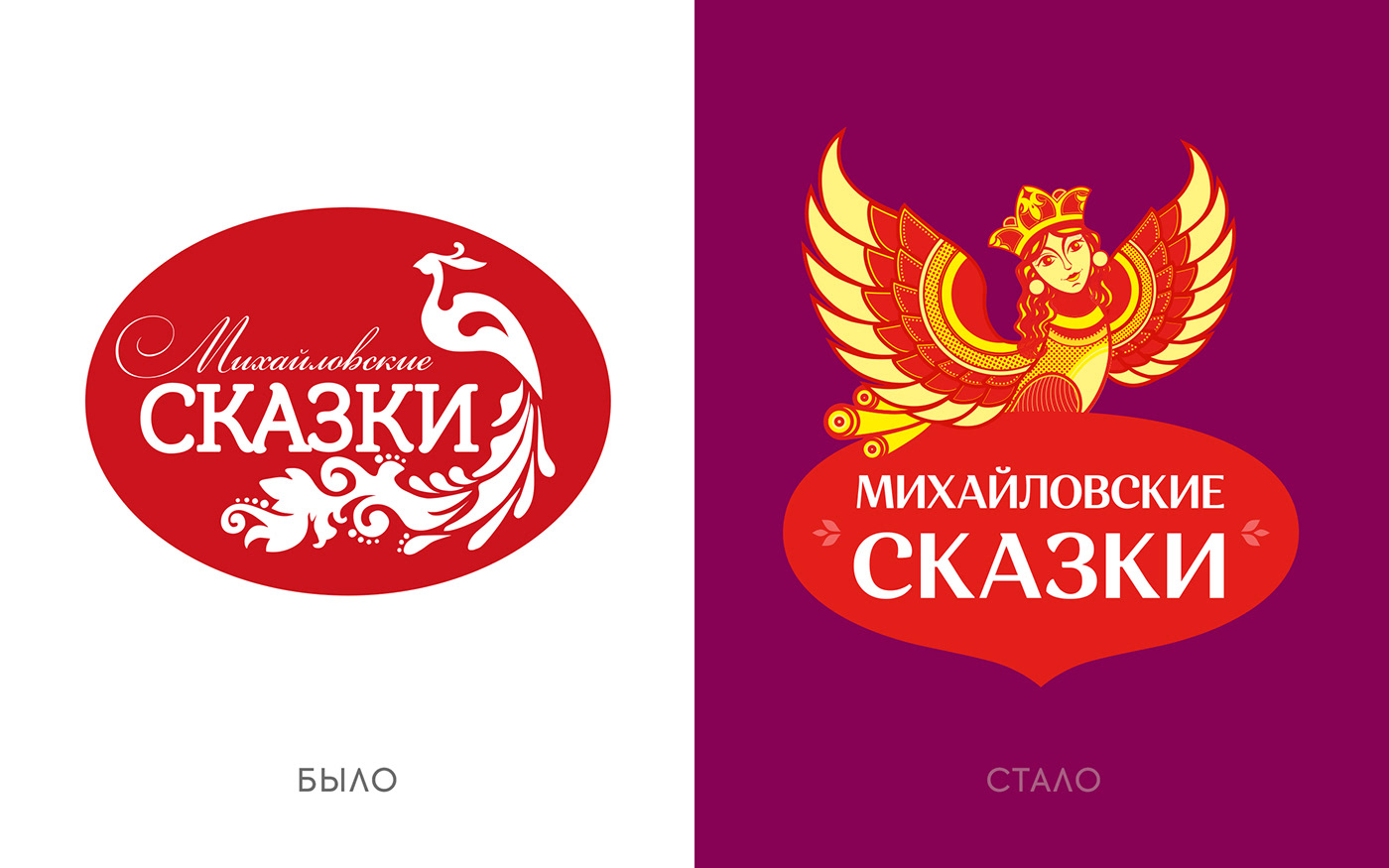
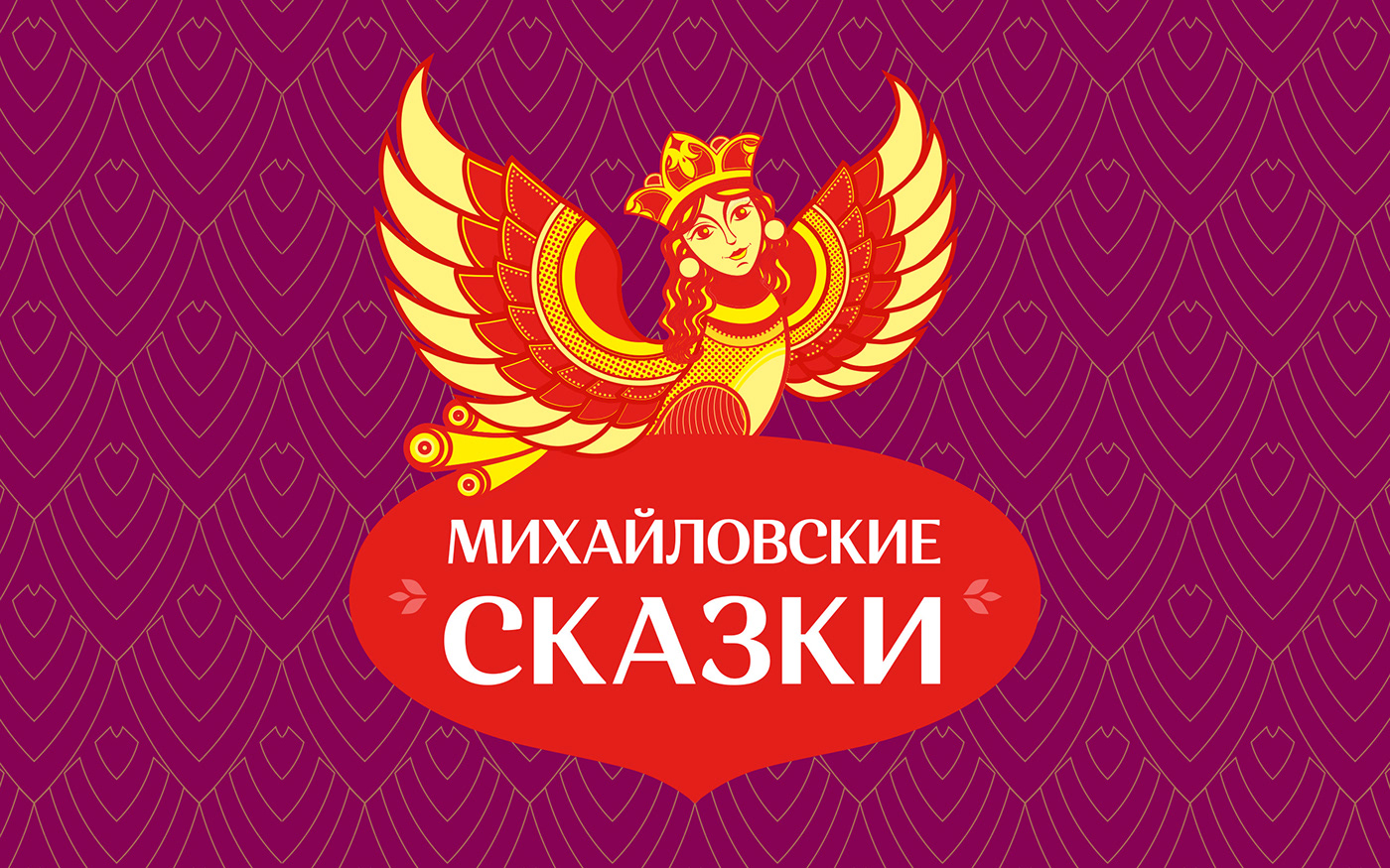
Based on this, we focused on the logo - the Firebird. By adding fairy-tale attributes, we were able to convey the “magic” of children’s perception, thereby reflecting the positioning of the brand and moving away from the main competitor - Yashkino.
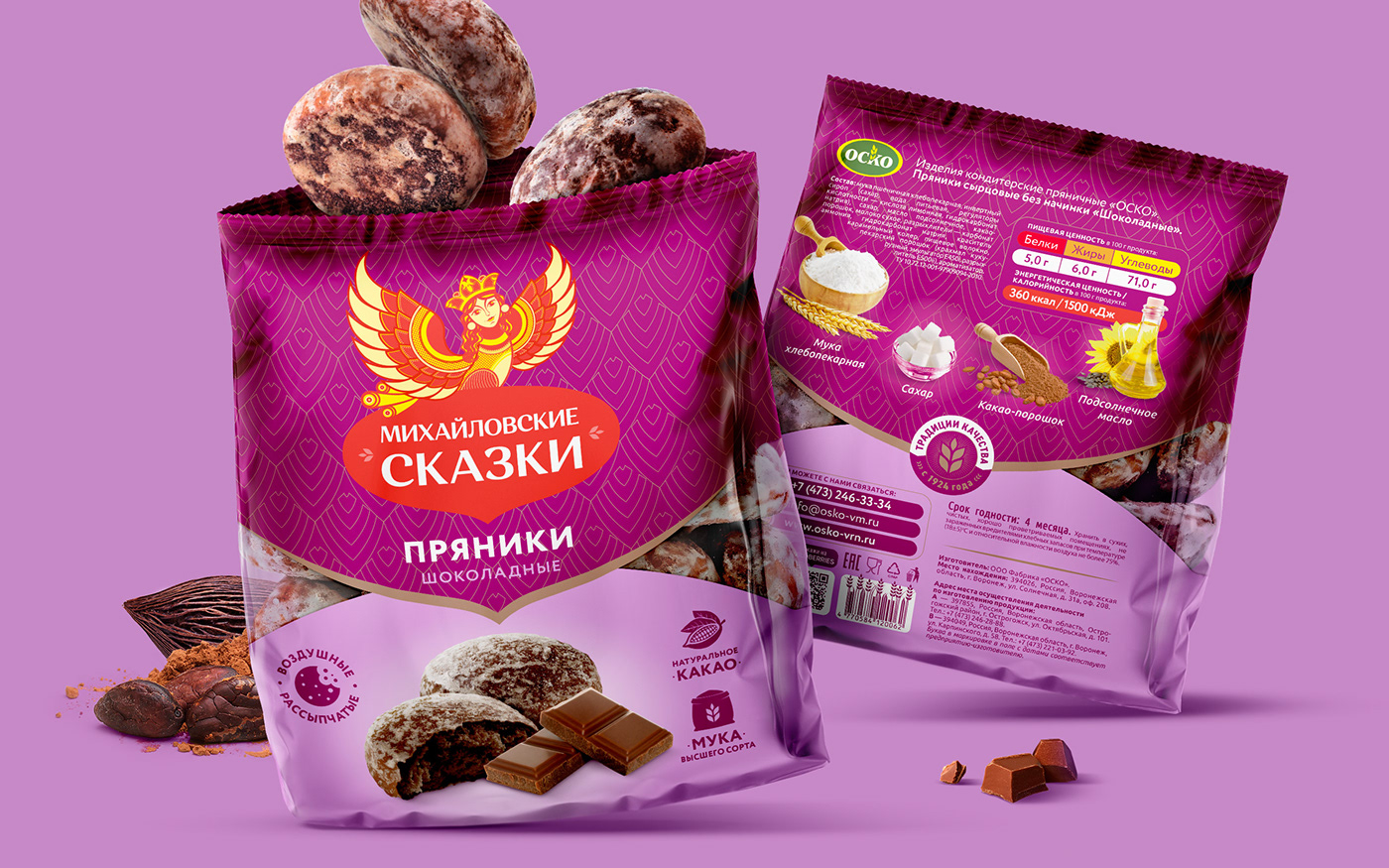
Developing the theme of fairy tales, we added to the design a signature brand color of an unusual garnet-eggplant shade, referencing the tales of Tsar Saltan.
We put the benefits of the product on the front side, and the ingredients on the back side, thereby emphasizing the naturalness of the product.
Thanks to this, the "Mikhailovskie Skazki" brand was able to reach the federal level in the middle price segment, as well as attract a young audience.


